The Gherkin: How London’s Famous Tower Leveraged Risk and Became an Icon (Part 2)

This four part series (originally published on Aggregate’s website) examines The Gherkin, the London office tower designed by Foster + Partners, showing how the urban icon engaged and leveraged perceptions of risk. In part one, author Jonathan Massey introduced the concept of "risk design” to describe how the Gherkin’s design managed the risks posed by climate change, terrorism, and globalization. In part two, below, Massey examines the Gherkin’s enclosure and ventilation systems in detail to explain how the building negotiated climate risk.

In a poster promoting London’s bid to host the Olympic Games, the Gherkin supported gymnast Ben Brown as he vaulted over the building’s conical peak. The image associated British athleticism and architecture as complementary manifestations of daring and skill, enlisting the Gherkin as evidence that London possessed the expertise and panache to handle the risk involved in hosting an Olympic Games.

But a poster created three years later offered a very different image. Created by activists from the Camp for Climate Action to publicize a mass protest at Heathrow Airport against the environmental degradation caused by air travel, this poster shows the Gherkin affording only precarious footing to a giant polar bear that swats at passing jets as its claws grasp at the slight relief offered by spiraling mullions and fins.

In this poster publicizing a protest at Heathrow Airport organized by the Camp for Climate Action, artist Rachel Bull depicted 30 St Mary Axe as an ambivalent climate change icon courting risks beyond its capacity to manage. Climate Camp (artist: Rachel Bull). The Camp for Climate Action, 2007. Offset lithograph poster.

Conflating the story of King Kong, a jungle monarch captured and killed by the metropolis, with the climate change icon of the solitary polar bear stranded on a melting ice floe, the poster associates the Gherkin with the rest of London’s corporate office towers through its sooty brown coloring yet sets the building apart by foregrounding its unique form and patterning. Like the Empire State Building for the famous gorilla, the Gherkin is at once the epitome of destructive capitalism and a redoubt that evokes aspects of the bear’s native environment while offering a dubious last chance for survival. Echoes of September 11 tinge the image with menace, suggesting that the Gherkin epitomizes the hubris of global finance. For artist Rachel Bull, the building is an ambivalent climate change icon courting risks beyond its capacity to manage.

The Gherkin is an especially suitable focus for the Camp for Climate Action poster because the building had come to exemplify innovation in sustainable tall office building design. Even before its completion, the building intervened in one of the major risk imaginaries preoccupying architects and many clients: the perception that human-induced climate change threatens economies and populations. 

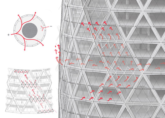
Articles about the design emphasized the mixed-mode ventilation that would allow the building to be cooled mechanically or through natural ventilation depending. The Gherkin is enclosed by a unique curtain wall that combines two systems. For most of its circumference on any given office floor, the building is encased by an exterior curtain wall of clear diamond-shaped double-glazed panels as well as an interior curtain wall of rectangular single-glazed panels fitted with blinds. In this Abluft or exhaust façade, heat that builds up in the airspace between the two curtain walls is exhausted to the outside by vents at the top of each one- or two-story zone. Where the enclosure adjoins the spiraling atria, the interior curtain wall is omitted and the exterior curtain wall is tinted to reduce solar heat gain as well as fitted with some operable windows that tilt open to admit fresh air. When weather permits, a computerized building management system can selectively open these windows, using the pressure differentials at atria thirty degrees apart around the façade to draw air in and through the building.

Many writers repeated the claim by Foster + Partners that the building management system would exploit these features to reduce the building’s energy consumption by as much as 50 percent relative to other prestige office towers. “Nature takes care of the temperature of the building,” Norman Foster explained in one interview. “It is only in extreme heat and cold that the windows close and the temperature is regulated by the automated air conditioning system.” [1] The Gherkin was “London’s first ecological tall building,” in the phrase used by Foster + Partners and circulated widely in the press, and it soon became a case study in books and courses on building technology and sustainable design. [2] The building emblematized the potential for architectural innovation to reduce resource consumption and so to reduce the likelihood of catastrophic climate change.

Managing climate risk was deeply inscribed in the design of 30 St. Mary Axe because it was integral to the market mission and brand identity of the client. Swiss Re is a reinsurance firm, the world’s second-largest insurer of insurance companies; it manages the risks taken on by risk managers. Reinsurance emerged in the 1820s as a local and regional risk-spreading measure among fire insurers in Germany and Switzerland, becoming an integral part of the financial risk management sector as the insurance industry internationalized during the latter part of the nineteenth century. Created in 1863 by two primary insurers and a bank following a fire in Glarus, Switzerland, the Swiss Reinsurance Company by the turn of the twentieth century was a leading firm in a globalized reinsurance market. While the San Francisco earthquake of 1906 tested its capacity to meet its obligations, the firm remained solvent to benefit from Swiss neutrality during World War I and from the weakness of Germany’s economy after the war, when the Swiss firm bought one of its competitors, Bavaria Re. The company expanded after World War II as social insurance became widespread among industrialized nations, and it has remained among the largest reinsurers alongside rival Munich Re. [3]

In 1995 the company created a new corporate identity, taking “Swiss Re” as its global brand name and adopting a new logo and minimalist graphic language. Shortly afterward, the firm constructed headquarters buildings for its operations in the United States and the United Kingdom, making architecture “a crucial communications tool and an intrinsic part of the Swiss Re brand,” according to Richard Hall, author of Built Identity, a company-sponsored volume on the firm’s architecture. [4] Completed in 1999 to a design by Dolf Schnebli of the Swiss firm SAM Architekten, the firm’s U.S. headquarters building is an expansive four-story office building on a wooded campus in Westchester County north of New York City, where a staff of 1,100 had previously worked in several midtown branch offices. Following its acquisition of British reinsurance firm Mercantile & General in 1996, Swiss Re embarked on a similar project in London, culminating in its creation of 30 St. Mary Axe.

Natural catastrophes are the primary cause of insured losses, so Swiss Re attentively monitors and predicts the impact of weather and climate on economic activity. The firm emphasizes sustainability in its corporate literature and policies. “For us, sustainability makes excellent business sense,” explained Sara Fox, the project director hired by Swiss Re to direct construction and occupation of 30 St. Mary Axe, “because we pay claims on behalf of clients for floods, heat waves, droughts. To the extent that these claims are related to global climate warming, it is only prudent of us to contribute as little to it as possible.” [5] At the same time, the company would seem to benefit from a perception that climate change poses insurable business risks; calling attention to climate risk could stoke demand for the company’s products.

By thematizing its environmental control systems and energy consumption features, Swiss Re’s new UK headquarters at once highlights climate risk and demonstrates the company’s commitment to managing that risk through practices of sustainability, construed as a strategy for managing the business risk posed by environmental degradation and climate change. The building’s ostentatiously streamlined form, tinted glass spirals, and visibly operable windows call attention to its capacity for supplementing or substituting mechanical ventilation with natural ventilation. Intentionally understated lighting at the building’s crown emphasizes restraint in energy consumption. The smoothness of that crown, where the doubly curving curtain wall resolves into a glass dome, eliminates the roof that so often supports chillers and fans—visible elements of industrial environmental control. By tucking this equipment into plant rooms near the top of the tower—as well as into the basement and a six-story annex building across the plaza—the building obscures the extent of its reliance on energy-intensive mechanical ventilation and temperature control. Instead of supporting mechanical equipment, the apex contains a private dining room with a 360-degree view that spectacularizes London. Seen from outside, as an element in the skyline or a patterned whorl in satellite images of the city, the summit of this distinctively roofless building stands out from neighboring buildings.

The architects brought to the project their own brand strength. Foster + Partners is unique among the world’s architecture firms in being both a top-grossing multinational and a high-reputation design firm headed by a star architect. With 646 architects on staff and annual fee income exceeding $200 million in 2012, Foster + Partners is the tenth largest architecture company in the world, and it held that same rank in 2003 as the Gherkin was nearing completion. With work around the globe that encompasses many medium- and large-scale buildings as well as infrastructure projects such as telecom towers, airports, and viaducts, the firm enjoys vast commercial recognition. This is particularly striking because it is the only firm of its size led by a single charismatic design principal and managed from one primary office. Perhaps because of this unusual character, the firm enjoys high levels of recognition from the state, the public, and the profession, as measured in honors bestowed by Queen Elizabeth on Norman Foster, accolades in the press and surveys, and architectural awards. [6]

The Foster + Partners brand is associated with highly controlled, self-contained buildings that employ modern industrial materials to celebrate technology and tectonic articulation. For Swiss Re—a company cultivating its image through architectural patronage—the firm likely appealed for additional reasons. The firm and its knighted founder were known and esteemed in British design and planning circles; they had already designed a tower for the St. Mary Axe site for property owner Trafalgar House; and they had expertise and prior experience completing innovative buildings, such as the Commerzbank Tower in Frankfurt (1997), that incorporate natural ventilation and other systems associated with sustainability.

In its design for 30 St. Mary Axe, the Foster firm employed a rhetoric of architectural organicism and evoked noteworthy precursor buildings to burnish the sustainability credentials of the new tower. In presentations to clients and planning officers, project architect Robin Partington likened an intermediate scheme to an egg, while Foster compared later versions to a pinecone. The firm constructed a lineage for the Gherkin that stretched back to the work of Buckminster Fuller, the onetime mentor of Foster’s who is a primary reference point for some concepts of sustainable design. [7] The building’s architects saw the Gherkin’s interior atria as successors to the planted “sky gardens” in the Commerzbank headquarters. The plaza and shopping arcade at the building’s base were modest vestiges of earlier schemes that featured extensively tiered leisure and commerce zones. To the architects they evoked precursor projects that reimagined the work environment as a planted landscape of open-plan trays within a glass enclosure, including the landmark building the firm had completed in 1975 for the insurance firm Willis Faber & Dumas and the Climatroffice, a 1971 concept for a multilevel escalatored office environment enclosed by an oval triangulated spaceframe.

The section and plan of the Climatroffice project (1971) show how the Foster firm reconceptualized the platforms, escalators, and enclosure of the U.S. Pavilion as elements in a freestanding climate-controlled office building. Courtesy of Foster + Partners.
The U.S. Pavilion at Expo 67 in Montreal, in which the United States Information Agency set floor decks linked by elevator and escalator within a five-eighths geodesic sphere, provided a model for the Climatroffice and successor projects from Foster + Partners, including 30 St Mary Axe. From I. Kalin, Expo ‘67: Survey of Building Materials, Systems, and Techniques Used at the Universal and International Exhibition of 1967 (Ottawa, Canada: Materials Branch, Department of Industry, Trade, and Commerce, 1967).

In the late 1960s and early 1970s, Fuller and Foster collaborated on a few unbuilt projects., and the Climatroffice was a direct adaptation of the U.S. Pavilion from Expo 67, an early attempt to regulate building climate performance by automating environmental control systems. Intermediate schemes for Swiss Re, known colloquially as “the haystack” and “the bishop’s miter” or “breadloaf,” adapted the platforms and escalators of the Climatroffice and the U.S. Pavilion to the St. Mary Axe site by partially submerging a stack of staggered floorplates belowground and encasing the stack in a glass-and-steel diagrid enclosure recalling Fuller’s spaceframes. [8]

These sketches made during the schematic design phase in spring 1998 suggests that the adapted Climatroffice configuration will create rentable daylit retail space below plaza level. Foster + Partners, 1004 Swiss Re House, 14 May 1998, 1998. Courtesy of Foster + Partners.
This schematic design from spring 1998 envisions 30 St Mary Axe as an adaptation of the Climatroffice, with staggered floorplates set within a curving steel-and-glass enclosure. Foster + Partners, Swiss Re House 1004, Progress Report, 21 April 1998, 1998. Courtesy of Foster + Partners.
Photographed in March 1998, these study models show the massing already permitted by the Planning Department alongside some of the alternative building configurations considered by Foster + Partners early in the design process. Foster + Partners, Swiss Re House 1004, Progress Report, 21 April 1998, 1998. Courtesy of Foster + Partners.

With its diagrid structure, double-curving glazed skin, and automated building management system (along with a rotating sunshade intended for installation inside the apex but not completed), the Gherkin evoked the U.S. Pavilion’s five-eighths geodesic sphere stretched vertically to improve its aerodynamics and accommodate office floors to a height capable of realizing the value of its constrained but expensive site. With his collaborators Shoji Sadao and John McHale, Fuller intended the U.S. Pavilion to function as a Geoscope (a global hypermap) and a facility in which exposition visitors could play the World Game, a scenario simulator through which they would test strategies for redistributing resources in order to maximize human well-being. (The platforms and escalators that filled the Expo 67 dome were added by another firm at the client’s insistence.) At 30 St. Mary Axe, as in the Climatroffice, Foster + Partners adapted the pavilion as built rather than as initially conceived, setting aside Fuller’s technocratic utopianism while adapting its forms, aesthetics, and technical solutions. Despite these differences, the building claimed the mantle of Fuller’s reflexive modernism, his attempt through technocratic design to automate processes of progressive optimization in resource use and so to steer humanity toward a more sustainable resource-use trajectory. [9]

Like the U.S. Pavilion, the Gherkin suggests that the ecological risks of modernization can be managed through technological innovation and that sustainable design can promote rather than inhibit economic growth. In another parallel to the U.S. Pavilion, the automated environmental control features at 30 St. Mary Axe have failed to achieve declared objectives. In practice, the Gherkin has not achieved the economies heralded during its construction and first occupancy. Its vaunted energy performance is imaginary.

In the Olympic bid poster and most other depictions of the building, 30 St. Mary Axe is sleek and self-contained, its every element integrated by a lucid geometry of circles and triangles. On Tuesday, April 26, 2005, though, that regulating geometry failed in a small but significant way when one of the building’s operable windows broke off and fell some twenty-eight floors to the ground. Building managers concluded that one of the mechanical arms controlling the window had failed. [10] Following this episode, Swiss Re and its management company disabled the mixed-mode building control system as they tested and replaced the chain-drive motors controlling window operation. The system has been used on only a limited basis since. Many tenants have walled off the atria, and some have insisted on lease provisions guaranteeing that mixed-mode ventilation will not be employed in their zones. Since 2005, as far as I can determine, the windows have opened only occasionally and only on the lower floors, which are occupied by Swiss Re. This means that mixed-mode ventilation is available in only one of the four sets of six-story atria. For all but its first year of operation, then, the building has run primarily on mechanical ventilation. [11]

One of the environmental consultants who modeled the building’s anticipated performance compares its owners and facility managers to overly cautious sports-car owners who never take the Ferrari out of second gear. However, it is not clear that the building could have lived up to the promised energy savings even if its mixed ventilation mode had been fully activated. The enclosure and ventilation system combines building components taken from climate-control strategies that are usually deployed independently and that may not work together from the point of view of building physics. (See the analytic drawing here)

The double-skin façade zones encased by clear glazing presume that air between curtain wall layers will absorb solar heat, rise due to the stack effect, and vent to the exterior through narrow slits at the top of each two-story structural bay. But these cavities are open at their sides to the two- and six-story atria that are intended to draw fresh air through the building by exploiting external pressure differentials. These atria in turn are—or were—open to the adjoining office floors. Rather than operating as discrete systems, then, the cavities, atria, and floors are integrated into continuous air masses. So if the triangular operable windows were opened as intended for natural or mixed-mode ventilation, the stack-effect venting of the double-skin facade zones, the pressure-differential venting of the spiral atria, and straightforward cross-ventilation within a single floor could all be operating simultaneously—and at cross-purposes. [12]

Shown here where it opens into the office floor at the base of one of the six-story atriums, the Abluft enclosure sandwiches blinds and encased diagrid struts between the exterior curtain wall and an inner curtain wall of rectangular glass sheets. Photograph by author.

While consultants who worked on the building claim that the building management system can manage the potential conflicts among these systems, pointing to the performance simulations they ran using computational fluid dynamics, as far as I have been able to determine the performance of the mixed-mode ventilation has never been rigorously tested or empirically confirmed. 

This plan view from a simulation of air flow and velocity through the sixth floor was among the many documents generated by environmental consultants BDSP during the design of 30 St Mary Axe to model the building’s environmental performance. BDSP, Swiss Re HQ, 2009. Presentation.
Like the previous image, this perspective view of a simulation of air velocities in Atrium 6 framed expectations about energy consumption at 30 St Mary Axe. BDSP, Swiss Re HQ, 2009. Presentation.

Nor has this hybrid of ventilation systems been employed in another tower before or during the decade since the design was completed, which suggests that neither the firm that designed the Gherkin nor the profession at large sees this as a valuable approach. The combination of double-skin facade, atria, and open floors connotes improved environmental performance and aligns the building with symbolically powerful precursors. But what it yields functionally is an internally incoherent environmental control system of undetermined performance capability.

The Gherkin makes extensive use of industrial materials whose manufacture consumes a great deal of energy, and the atria give it an unusually low ratio of usable square footage to total square footage. If its provisions for natural ventilation are not used, 30 St. Mary Axe is not a green tower but an energy hog. It is striking, then, that the building has been a critical and financial success despite its failure to realize one of the headline claims made about its design. In 2007, well after the window break and market preferences curtailed use of mixed-mode ventilation, Swiss Re sold 30 St. Mary Axe to a pair of investment companies in a deal valued at six hundred million pounds, or $1.2 billion—at the time a record for the sale of an office building in the United Kingdom. The reinsurance firm, which took a long-term lease on the floors it occupied, netted a profit estimated at more than $400 million. [13] Rather than substantively reducing the contribution that 30 St. Mary Axe makes to climate change, its envelope has positioned building and client advantageously within a climate change risk imaginary.

Even if it has not reduced the energy consumption of its occupants, 30 St. Mary Axe has changed that risk imaginary by persuading people that design can manage the climate risk of postindustrial production. For this, the building needed to change perceptions, and this task was achieved by design features that highlight the building’s capacity for natural ventilation, combined with simulations that imagined how the building would perform. [14] In legitimizing the building as an exemplar of sustainable design, the simulations created space for the design risks that this innovative and cynical building runs. Addressing the imagination rather than the climate, they bought its designers freedom.

In the next installment, this article will examine how the Gherkin engaged the risk imaginary associated with terrorism.

Architect and historian Jonathan Massey is Laura J. and L. Douglas Meredith Professor for Teaching Excellence at Syracuse University, where he has chaired the Bachelor of Architecture program and the University Senate. A founder of the Aggregate Architectural History Collaborative and co-editor of its online journal, Massey is deeply engaged in shaping the ways we research architecture and its history. His book Crystal and Arabesque (University of Pittsburgh Press, 2009) showed how American modernist architects engaged new media, audiences and problems of mass society. His work on topics ranging from ornament and organicism to risk management and sustainable design has appeared in many journals and essay collections, including Governing by Design: Architecture, Economy, and Politics in the 20th Century (University of Pittsburgh Press, 2012).

Diagram by Andrew Weigand.
Andrew Weigand is a young New-York-based designer focused on how design affects the social and civil support systems underlying society. He operates at the intersection of public space with art, ecology, and infrastructure, working collaboratively across scales ranging from didactic graphics to architecture, urbanism, and landscape. Recent projects include a proposal for an infrastructural park in Queens, a habitat for meditation, furniture for an art education facility, a summer art pavilion, and a variety of illustrations.

Cite this piece as Jonathan Massey, “Risk Design,” The Aggregate website (Transparent Peer Reviewed), http://we-aggregate.org/piece/risk-design.

[1] See “Swiss Re’s Gherkin Opens for Business,” Reactions, 27 May 2004.

[2] For one instance of the claim that 30 St Mary Axe is “London’s first ecological tall building,” see Jenkins, 487. For an example of the building’s role as a case study, see Joana Carla Soares Gonçalves and Érica Mitie Umakoshi, The Environmental Performance of Tall Buildings (London: Routledge, 2010), 251–257.

[3] Martin Lengwiler, “Switzerland: Insurance and the Need to Export,” in World Insurance: The Evolution of a Global Risk Network, ed. Peter Borscheid and Niels Viggo Haueter (Oxford, UK: Oxford University Press, 2012), 143–166. See also Reinsurance, ed. Robert W. Strain (New York: College of Insurance, 1980).

[4] Richard Hall, Built Identity: Swiss Re’s Corporate Architecture (Basel: Birkhauser, 2007), 5.

[5] James S. Russell, “In a City Averse to Towers, 30 St. Mary Axe, the ‘Towering Innuendo’ by Foster and Partners, Is a Big Ecofriendly Hit,” Architectural Record 192, no. 6 (1 June 2004): 218. For the firm’s representations of its relation to natural disasters and sustainability, see the corporate reports at http://www.swissre.com/, in particular at http://www.swissre.com/sigma/.

[6] Vanessa Quirk, “The 100 Largest Architecture Firms in the World,” ArchDaily, 11 February 2013, http://www.archdaily.com/330759/the–100-largest-architecture-firms-in-the-world/; World Architecture 100, WA100 2013 (January 2013), http://www.bdonline.co.uk/wa-100; and Donald McNeill, “In Search of the Global Architect: The Case of Norman Foster (and Partners),” International Journal of Urban and Regional Research 29, no. 3 (September 2005): 501–515. See also Kris Olds, Globalization and Urban Change: Capital, Culture, and Pacific Rim Mega-Projects (Oxford, UK: Oxford University Press, 2001), 141–157. For detailed discussion of the management structure introduced in 2007, when Mouzhan Majidi became chief executive heading a group of semiautonomous practice groups while Foster became chairman, see Foster + Partners, Catalogue (Munich: Prestel, 2008); and Deyan Sudjic, Norman Foster: A Life in Architecture (London: Weidenfeld and Nicolson, 2010), 269–279.

[7] See Jonathan Massey, “Buckminster Fuller’s Reflexive Modernism,” Design and Culture 4, no. 3 (November 2012): 325–344; and Eva Díaz, “Dome Culture in the Twenty-First Century,” Grey Room 42 (Winter 2011): 80–105.

[8] Intermediate design iterations and rationales are presented in Ove Arup & Partners, “Swiss Re, Swiss Re House, Concept Report,” 1999; Foster + Partners, “Swiss Re House 1004,” presentation document, 29 April 1998; Foster + Partners, “Swiss Re: London Headquarters, Architectural Design Report,” vol. 1, sec. 2, July 1999; and Foster + Partners, “B1004 Stage C Design Report,” 21 January 1999, among other planning reports in the collection of Richard Coleman Citydesigner.

[9] Jonathan Massey, “Buckminster Fuller’s Cybernetic Pastoral,” Journal of Architecture 11, no. 4 (September 2006): 463–483; and Massey, “Buckminster Fuller’s Reflexive Modernism.” For examples of the firm’s association of 30 St. Mary Axe with Fuller’s work, see Jenkins, 538–545.

[10] Martin Wainwright, “Gherkin Skyscraper Sheds a Window from 28th Storey,” Guardian, 26 April 2005, http://www.guardian.co.uk/society/2005/apr/26/urbandesign.arts; and Sara Fox, interview, 5 October 2011.

[11] Interviews with Sinisa Stankovic (27 September 2011) and Richard Stead (27 September 2011).

[12] Interviews with Alistair Lazenby (18 October 2011) and Guy Nordenson (27 October 2011). Lazenby suggests that some of the “illogicalities” in the design, such as the placement of the single-glazed curtain wall inside rather than outside the double-glazed curtain wall and the open sides of the Abluft cavities that allow hot air to overspill into the atria, were trade-offs to reduce maintenance costs by bringing the steel diagrid structure inside the double-glazed enclosure, thereby reducing its susceptibility to rust and the attendant protection and inspection measures that building codes would have required.

[13] Haig Simonian, “Gherkin Sale Helps Swiss Re Beat Estimates,” Financial Times, 9 May 2007. 

[14] Some of the relevant simulations are contained in Hilson Moran (Matthew Kitson), “Ventilated Office Façade Environmental Performance,” 28 May 2002, in F+P Archives F0000749192 Box: 7725/ID: 49049; and BDSP, “Swiss Re HQ,” presentation, n.d.; as well as Norman Foster Works 5, ed. David Jenkins (Munich: Prestel, 2009) and many other publications

About this author
Cite: Jonathan Massey. "The Gherkin: How London’s Famous Tower Leveraged Risk and Became an Icon (Part 2)" 12 Nov 2013. ArchDaily. Accessed . <https://www.archdaily.com/447205/the-gherkin-how-london-s-famous-tower-leveraged-risk-and-became-an-icon-part-2> ISSN 0719-8884

You've started following your first account!

Did you know?

You'll now receive updates based on what you follow! Personalize your stream and start following your favorite authors, offices and users.